What is a Responsive Web Design and What Is The Ideal Screen Size For It?

It's like breathing.
You don't really notice it until someone mentions it. I am talking about responsive web designs.
Of course, web design is much more nuanced than breathing, but make no mistake—the work that goes behind breathing is quite complex, too.
But what is a responsive web design? What does it mean when we ask, "What's the ideal size for it?"
With the onset of the digital age, we have become a part of the internet. Day in and day out, we surf the internet without thinking about the websites we visit, how they store information, or how information is passed around so quickly.
Of these things to ponder, today I'd like to tickle your fancy regarding websites.
Yes, websites that you see whenever you open a browser: YouTube, Facebook, Amazon, Paypal, and many more. The list is almost infinite.
Have you ever wondered how web developers manage to code a one-size-fits-all website? By size, I mean the size of different screens that we use to surf the internet, such as mobile phones, tablets, laptops, TVs, monitors, and more.
Or is there even a code to make a website one-size-fits-all?
What is a Responsive Web Design?
It is an approach to web development that makes sure a website's layout adapts and functions properly with various screen sizes and devices. Coined by Ethan Marcotte in 2010, the term encompasses a set of techniques and principles aimed at creating flexible, fluid, and adaptive websites.
Core Principles:
Fluid Grids: Traditional web design relies on fixed-width layouts. In contrast, RWD uses fluid grids, where elements are sized in relative units like percentages rather than absolute units like pixels. Incorporating tools like an AI image generator can enhance responsive web design by providing adaptable visuals tailored to different screen sizes and layouts.This ensures that elements scale proportionally according to the screen size.
Flexible Images: Images in responsive design are also made flexible. They resize within their containing elements, ensuring they don't overflow or look distorted on multiple screens. CSS techniques like max-width: 100% are often employed to achieve this.
Media Queries: These are a fundamental part of CSS3 that allows the application of different styles based on device characteristics, such as screen width, height, resolution, and orientation. They enable developers to create breakpoints where the design adjusts to provide an optimal viewing experience. To implement these features effectively while catering to local user preferences, many businesses in Australia partner with Web design Sydney firms. Partnering with a nearshore software development company can bring the expertise needed to implement these responsive design features effectively, ensuring your project is optimized while fostering close collaboration and minimizing time zone differences.
What is its Importance?
Improved User Experience
RWD ensures that users have a consistent and pleasant experience regardless of the device they use. This can lead to more extended site visits, lower bounce rates, and higher engagement.
SEO Benefits
Search engines like Google prioritize mobile-friendly sites in their rankings. A responsive design that works properly with different screen resolutions ensures that a single URL and HTML are used across devices, which is beneficial for SEO.
Cost Efficiency
Maintaining one responsive website is more cost-effective than managing multiple versions of the same site for different devices.
Future-Proofing
With the proliferation of new devices with varying common screen sizes, a responsive design is a future-proof solution that can adapt to new technologies without requiring a complete redesign. Partner agencies that offer design as a service and can help businesses maintain a seamless, up-to-date user experience across all platforms, ensuring ongoing adaptability without the need for constant redesigns.
Finding The Ideal Screen Size
Choosing the "ideal" screen size isn't about choosing a single dimension but about understanding the range of sizes your audience uses and ensuring your design works well across these dimensions.
Until a few years ago, the majority of users on the internet used computers. It is just in the last few years that the rise of mobile phone users has gone through the roof.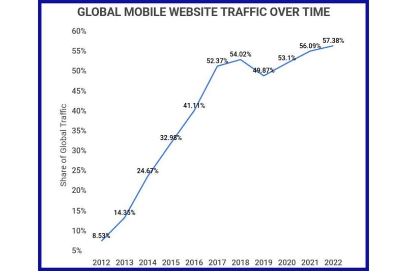
With that in mind, web developers have an extra variable that they need to keep in mind. Here are some guidelines and considerations to keep in mind.
Popular Screen Sizes
Mobile Phones: Typically, the width ranges from 320px (small devices like older iPhones) to around 414px (larger devices like the iPhone 11 Pro Max). Common breakpoints include 320px, 375px, and 414px.
Tablets: Tablets generally range from 600px to 768px in width. Popular breakpoints include 600px (small tablets in portrait mode) and 768px (iPad and other larger tablets in portrait mode).
Laptops and Desktops: These devices vary significantly, but standard breakpoints include 1024px (small desktops and laptops), 1280px (standard desktops), and 1440px (larger desktops and high-resolution screens).
Large Screens and TVs: For huge displays, like TVs or large monitors, breakpoints might be set at 1920px and above.
Implementing Breakpoints
While it's tempting to design for specific devices, it's more practical to use breakpoints that cater to groups of devices. Here's a simplified approach:
Small Devices (Mobile): up to 480px
Medium Devices (Tablets): 481px to 768px
Large Devices (Desktops): 769px to 1024px
Extra Large Devices (Large Desktops and TVs): 1025px and above
Designing for the Extremes
Mobile-First Design: Start designing for the smallest screens first and then progressively enhance the design for larger screens. This ensures that the core content and functionality are accessible on all devices.
Desktop-First Design: Start with the largest screen size and scale down. This approach can sometimes lead to a more aesthetically pleasing design for larger screens but may require more effort to ensure it degrades gracefully for smaller screens.
Testing For Multiple Screen Resolution
Testing is a critical phase, ensuring your design adapts well across various devices and screen sizes. Here are some practical tools and methods for comprehensive testing:
Google's Mobile-Friendly Test
Google's Mobile-Friendly Test is a free tool that analyzes a URL and reports if the page is mobile-friendly. It's a quick way to check how well your site adapts to mobile devices and to identify issues that could affect user experience and SEO ranking.
How to Use:
Enter the URL of your web page into the tool.
Key Features
Provides a screenshot of how the page looks on a mobile device.
Offers insights on mobile usability issues, such as text size, viewport settings, and touch element spacing.
Link: Google's Mobile-Friendly Test
BrowserStack
BrowserStack is a robust cloud-based testing tool that allows developers to test websites on a vast range of real devices and browsers. It supports both manual and automated testing, making it invaluable for ensuring cross-browser and cross-device compatibility.
How to Use
Sign up and log in to BrowserStack.
Choose the device and browser combinations you want to test.
Interact with your site on a real device via the cloud.
Key Features
Access to over 2,000 real devices and browsers.
Automated testing with Selenium.
Real-time testing with live, responsive, and interactive sessions.
Debugging tools and integrated development environments (IDEs) support.
Link: BrowserStack
Physical Device Testing
While tools are helpful, testing on actual devices is the best. Using physical devices ensures you experience exactly what your users do, capturing nuances that might be missed in virtual testing environments.
How to Approach
Gather a range of devices covering different operating systems, screen sizes, and resolutions.
Test your website on each device, focusing on both functionality and user experience.
Check both portrait and landscape orientations.
Key Considerations
Test on both old and new devices to ensure backward compatibility.
Consider different network conditions, like slower mobile networks.
Pay attention to touch interactions, such as tap targets and gestures.
Orientation Testing
Testing your website in both portrait and landscape orientations is crucial, especially for devices like tablets and smartphones that users frequently rotate.
Key Considerations
Ensure the layout remains functional and visually appealing in both orientations.
Check for elements that may be cut off or require excessive scrolling.
Validate that touch targets and interactive elements are easily accessible in both orientations.
Future-Proofing
Anticipating and preparing for future devices is a wise strategy. While it's impossible to predict all future screen sizes and device capabilities, designing with flexibility and scalability in mind can help ensure your site remains robust over time.
Techniques
Use relative units (like percentages) instead of fixed units (like pixels) for layouts.
Employ CSS Grid and Flexbox for more adaptable layouts.
Regularly update your testing devices and tools to include the latest models.
Best Practices
Flexible Layouts: Use a flexible grid layout that uses relative units like percentages instead of fixed units like pixels. This ensures the design adjusts to different screen sizes.
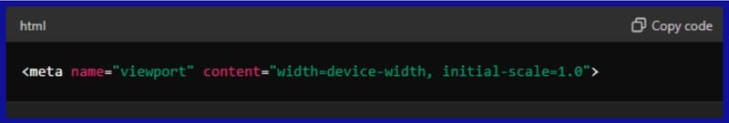
Viewport Meta Tag: Always include the viewport meta tag in your HTML head to control the layout on mobile browsers. For Example:
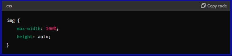
Fluid Images: Ensure images are flexible and can scale within their containing elements. Use CSS to make images responsive:
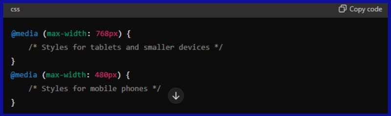
Media Queries: Use it to apply different styles based on device characteristics. For example:
Responsive Typography: Ensure text is readable on all devices by using responsive typography. Relative units like ems or rems can help scale text appropriately.
Responsive Typography: Ensure text is readable on all devices by using responsive typography. Relative units like ems or rems can help scale text appropriately.
Touch-Friendly Navigation: Ensure that navigation elements are easy to tap on touchscreens and that there is adequate spacing between links and buttons.
Performance Optimization: Optimize images and other resources to ensure quick load times on all devices. Use images with the `<picture>` element or `srcset` attribute to serve different images based on device characteristics.
Consistent Experience: Aim for a consistent user experience across devices. Ensure that functionality and content are accessible on all screen sizes, even if the layout changes.
Conclusion
Responsive Design is a crucial aspect of modern web development. It ensures that websites provide an optimal user experience across a myriad of devices and screens.
Web developers can create websites that are both functional and visually appealing by adhering to the principles of fluid grids, flexible images, and media queries and considering a range of screen sizes, from mobile phones to large desktop monitors.