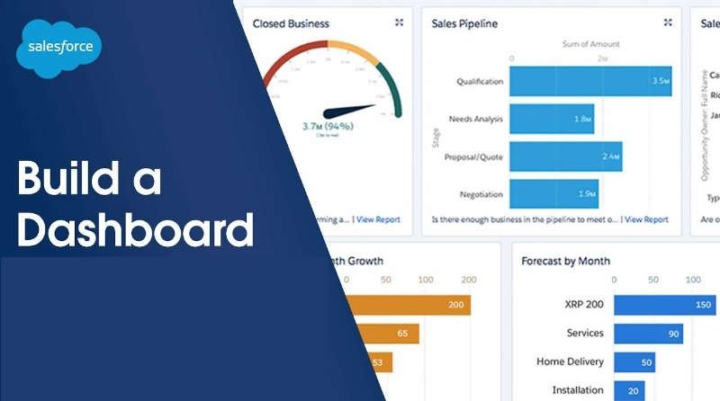
How To Create a Dashboard In Salesforce | Salesforce Dashboard Tutorial
A Salesforce dashboard is a visual representation of your organization's key performance indicators (KPIs), providing a snapshot of real-time data and insights to help you make informed decisions. Dashboards on the Salesforce platform offer unparalleled customization and flexibility, enabling users to extract valuable insights and maximize their business potential.
Different types of charts can be used in more or more reports, letting you display the data as you need. You can even combine data for multiple reports to present it in a way that makes the most sense for your team.
In this article, we will explore the importance of Salesforce dashboards, along with advanced techniques on how to create dynamic Salesforce dashboards that will make your organization effective and powerful. By implementing Salesforce CRM, you can leverage these dashboards to gain valuable insights and enhance your business operations.
The Twofold Factor of Dashboards:
Real-time decision-making is a cornerstone of modern business success. Salesforce dashboards provide an up-to-date view of critical KPIs that enable quick identification of trends and patterns. You only need to view dashboards to get instant KPI insights.
This valuable information facilitates prompt decision-making based on current data, ensuring that organizations can respond to market changes and new opportunities with agility.
Increased collaboration is another key advantage of Salesforce dashboards, as they can be shared among teams to promote transparency and foster a data-driven culture within the organization. Encouraging discussions and cross-functional collaboration can lead to more effective problem-solving and innovation, resulting in better business outcomes.
We'll learn how to create effective Salesforce Dashboards by going through the steps to create one.
Steps to Create a Dashboard in Salesforce
1. Plan and identify the requirements
Before diving into the dashboard creation process, it's essential to determine the key performance indicators (KPIs) and metrics you want to track. This will guide the design and layout of your dashboard. If there are a lot of KPIs, separate dashboards could be considered, but having only the most important information on one dashboard makes the most sense.
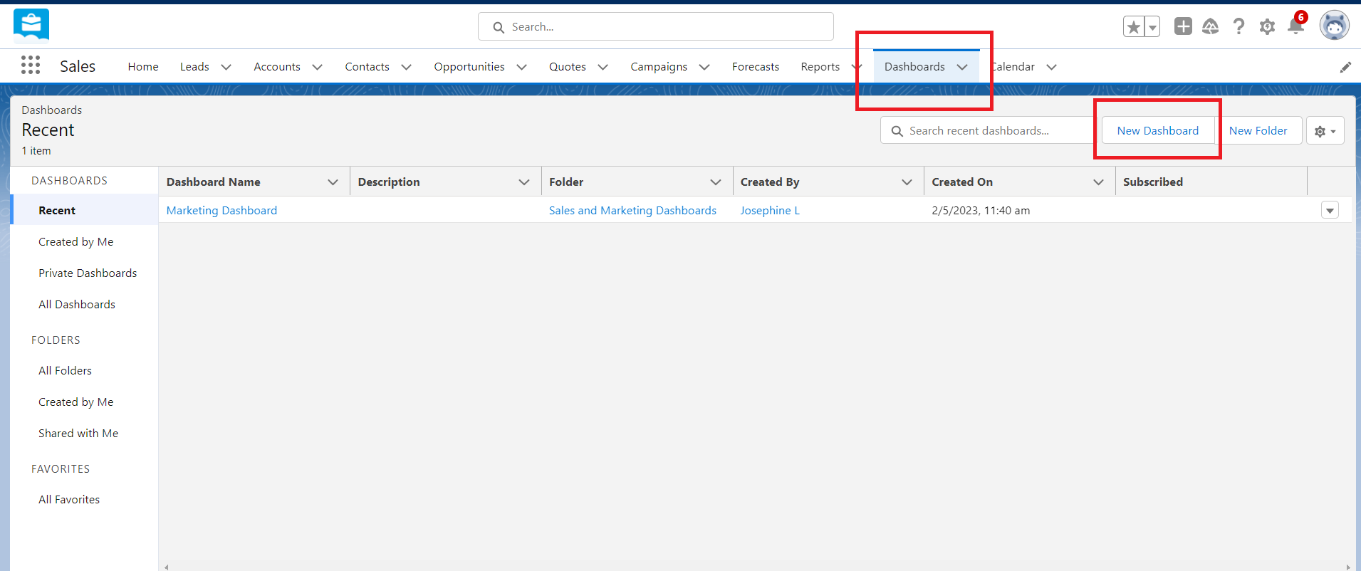
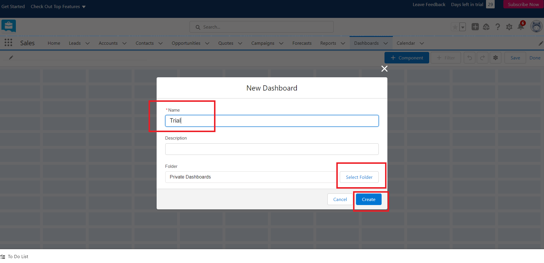
2. Access the Salesforce Dashboard tab
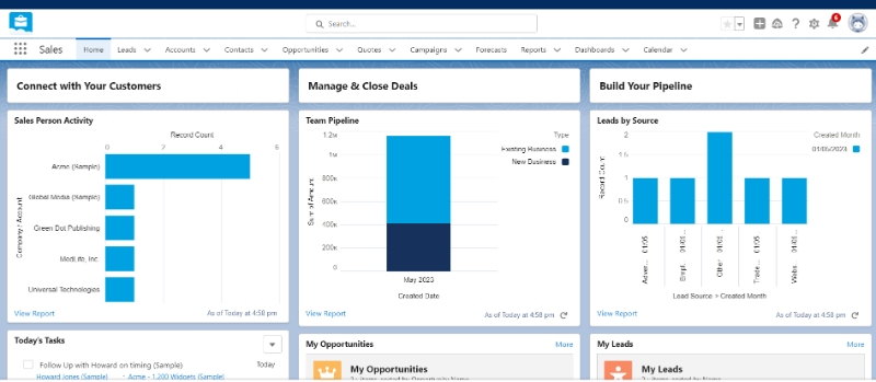
Log in to your Salesforce account and navigate to the 'Dashboards' tab. If you don't have an account, you can create one for free without credit card info. Salesforce offers multiple options, with its Enterprise edition being the most popular. Once logged in, click on the 'New Dashboard' button to start creating your custom new dashboard.
3. Choose a layout
Salesforce offers a variety of dashboard layouts to suit your needs. Select the one that best fits the data and metrics you want to display.
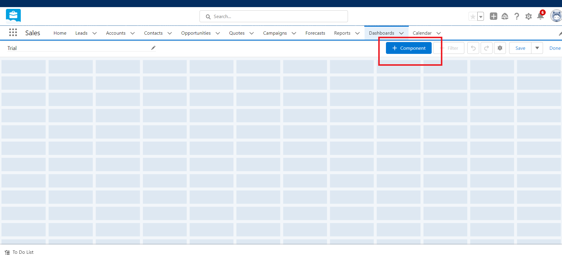
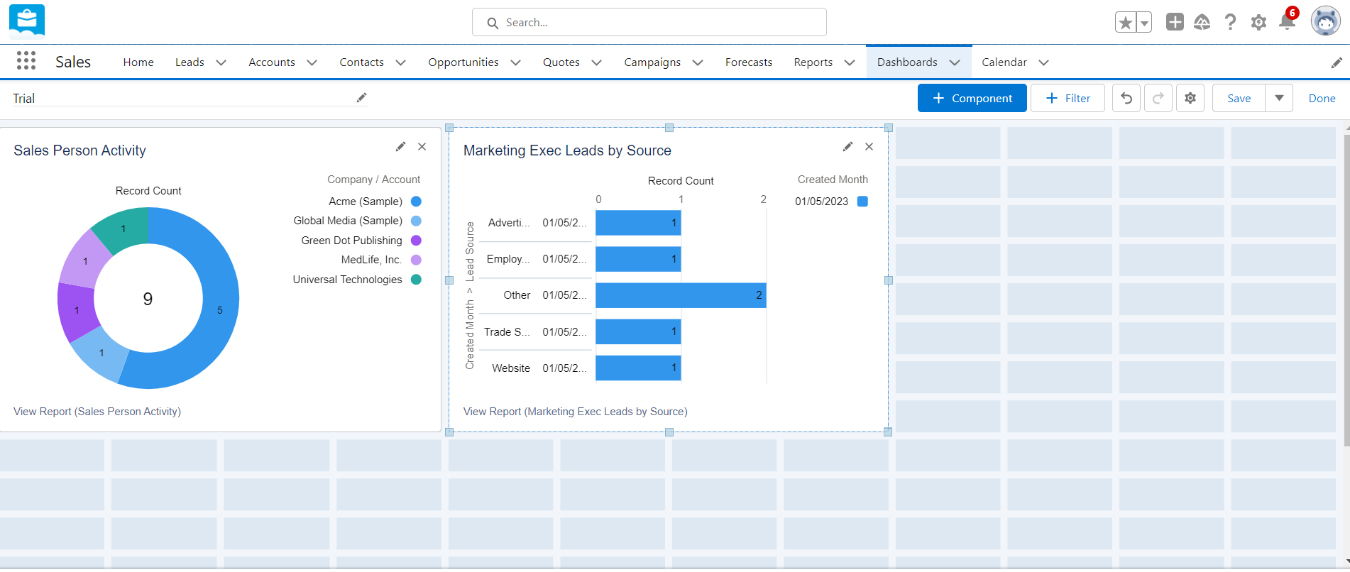
4. Add dashboard components
Drag and drop components from the available list to your dashboard layout. Components can include charts, gauges, metrics, and tables, among others. Using tables with customized columns enhances the quality of the data. Each column can be renamed, altered, and rearranged to fit the needs of the data.
5. Configure components
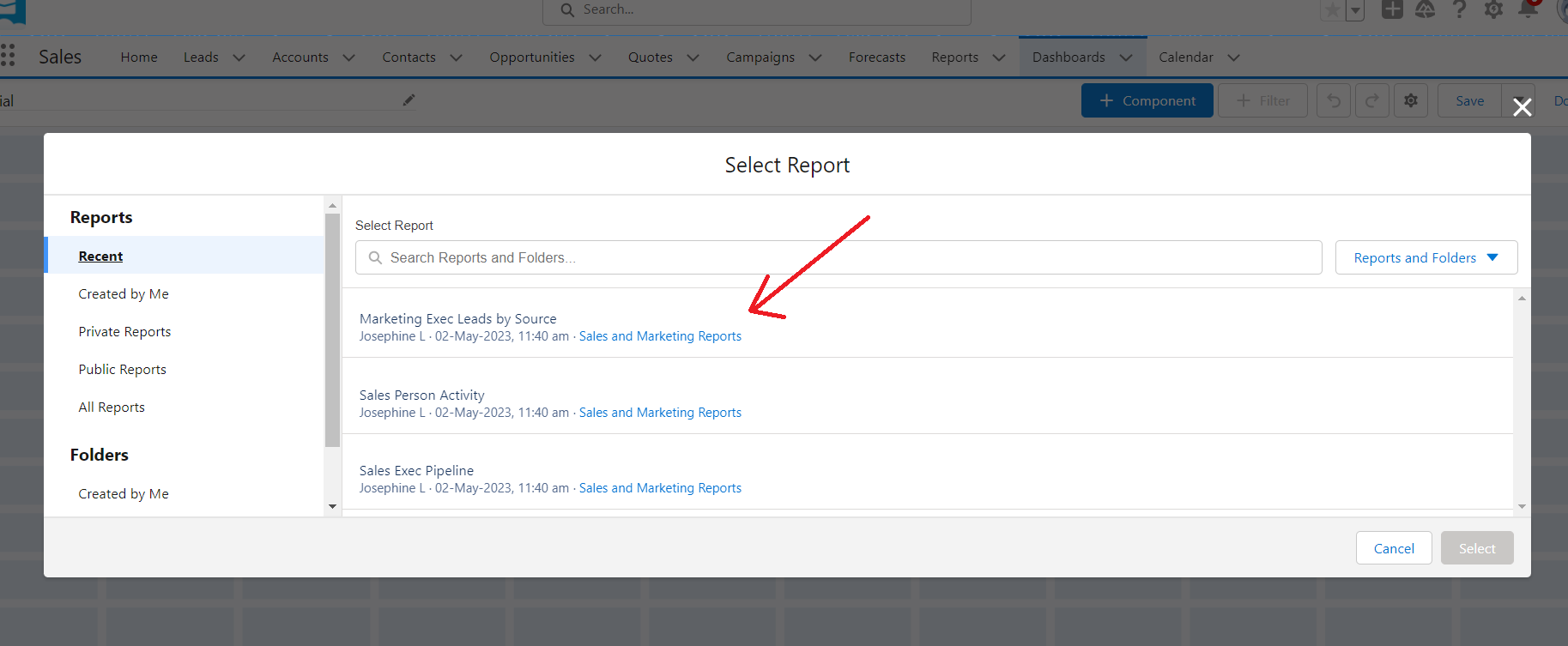
Customize each component by setting data sources, filters, and display options. Ensure the components effectively represent the KPIs and metrics you identified earlier.
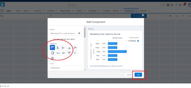
Choose the visual representation that best fits the data in question. For example, a vertical bar chart would be a good choice for no. of sales, while a pie chart would fit better for demographic segmentation
6. Organize and arrange components
Arrange the components on your dashboard in a logical and visually appealing manner. This will improve the user experience and make it easier to analyze the data.
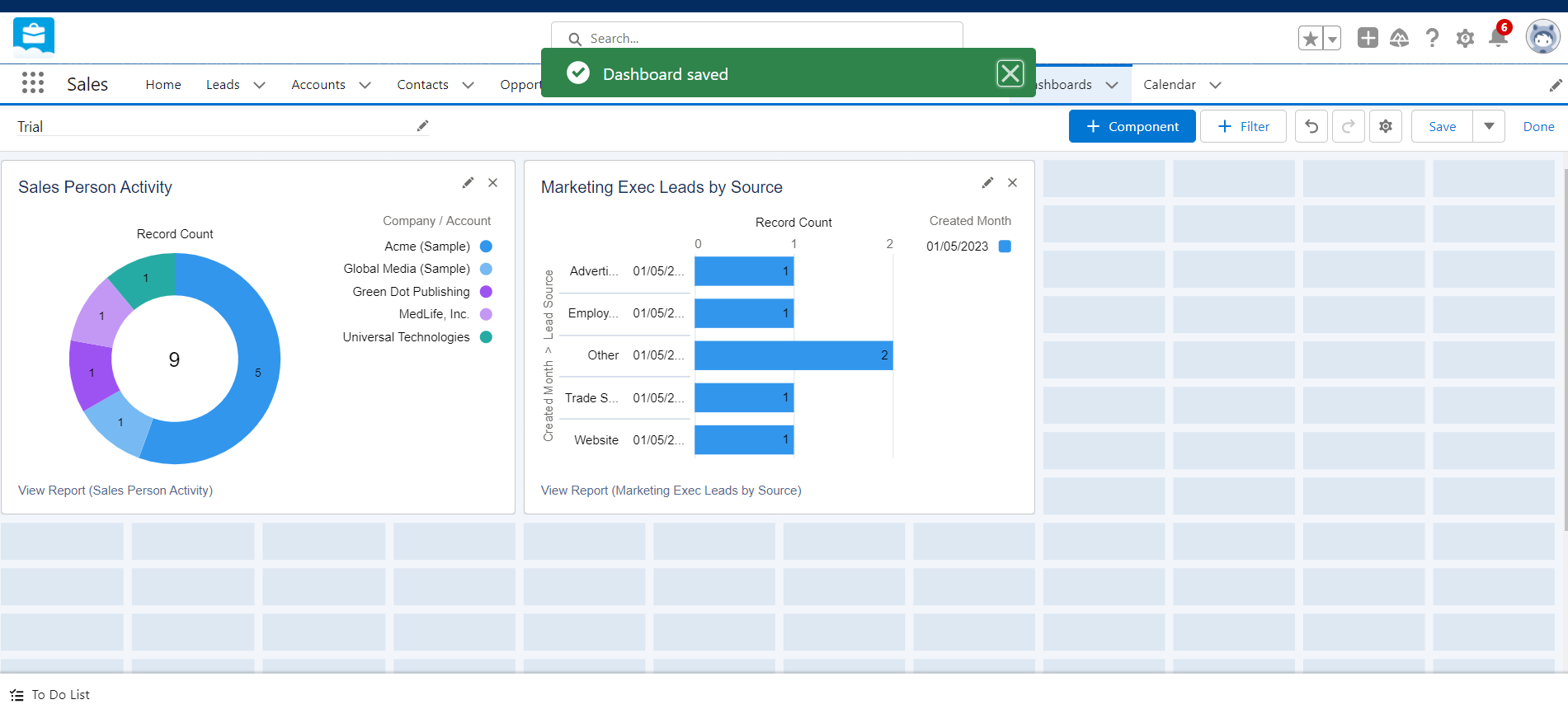
7. Save and share the dashboard
After finalizing your dashboard design, save your work and share it with relevant stakeholders within your organization.
Done! You can make multiple dashboards and create a report or multiple reports based on your needs. The dashboards can be organized and managed from the Dashboard folder.
Salesforce Lightning
Creating dashboards in Salesforce Lightning is a streamlined and intuitive process. The above-stated steps can also be used in their advanced version, 'Salesforce Lightning', to get better output. The Lightning experience includes a lot of additional features, like
- Enhanced dynamic dashboards and filter options.
- Advanced conditional formatting and Data Visualization techniques.
- Use Lightning Web Components (LWC): LWCs are reusable custom elements built using HTML, CSS, and JavaScript, which can be incorporated into your Salesforce Lightning dashboards for enhanced functionality and customization.
- Integrate Third-Party Tools: Explore and integrate third-party tools and plugins to extend the functionality and capabilities of your Salesforce Lightning dashboard.
- Use Advanced Data Visualization Techniques: Implement advanced data visualization techniques, such as heatmaps, treemaps, and geographic maps, to provide users with more insightful and interactive data representations.
- Generate your desired CRM Analytics and Salesforce Reports at the drop of your hat.
Learn How to Build a Salesforce Dashboard
The main difference between Salesforce Classic and Salesforce Lightning is the user interface and the technology stack behind each version. Salesforce Lightning is a more modern, intuitive, and feature-rich interface that offers better customization capabilities, improved performance, and a consistent mobile experience. While Salesforce Classic is still supported and functional, Salesforce continues to invest in and develop the Lightning platform, making it the recommended choice for most organizations.
Inputs for an Effective Salesforce Dashboard:
- The first is to identify the key metrics that are important to the business. These metrics should be aligned with the organization's goals and objectives and should be measurable.
- Determine the specific goals the dashboard should address and ensure that these objectives align with your overall business strategy.
- The dashboard should be tailored to the needs of the users who will be accessing it. For example, a sales dashboard may focus on metrics such as pipeline, win/loss rate, and quota attainment, while a marketing dashboard may focus on metrics such as lead generation, campaign ROI, and website traffic.
- Select KPIs that directly reflect the dashboard's objectives and prioritize them based on their relevance and impact.
- Ensuring data quality is a vital aspect of any successful dashboard. Invest in data validation and cleansing processes and establish data governance policies to maintain data integrity.
- Salesforce provides a suite of analytics tools, including Einstein Analytics, that can be used to gain deeper insights into business operations.
- Einstein Analytics provides predictive analytics capabilities, allowing organizations to forecast trends and identify potential issues before they occur.
- Keep the dashboard simple and focused. A dashboard should not overwhelm users with too much information.
- Ensure that the dashboard is updated frequently. Outdated data can lead to incorrect insights and poor decision-making.
Make an Effective Dashboard - Tips and Tricks
Advanced Techniques for Salesforce Dashboard Creation:
Dashboard design principles and data visualization best practices play a crucial role in the effectiveness of your Salesforce dashboard. Effective data visualization can help users quickly identify trends and patterns in their data, optimizing better conclusions.
Best practices for data visualization include using clear and concise labels, leveraging color to highlight important data points, and using charts and graphs to display complex data sets. Opt for a clean, simple layout to facilitate easy interpretation and group related KPIs and metrics together for better context. Utilize visual cues, such as colors and icons, to highlight important information and make your dashboard more engaging.
Dynamic filters and user interactivity can greatly enhance the value of your Salesforce dashboard. Implement dynamic filters for users to customize their view and enable drill-down capabilities for deeper analysis. Encouraging user interaction promotes active engagement with data, leading to better insights and more informed decision-making.
Leveraging advanced Salesforce features can further improve your dashboard's effectiveness. Utilize custom report types for unique data requirements and integrate external data sources using Salesforce Connect. You can also explore Artificial Intelligence (AI) capabilities with Salesforce Einstein, offering predictive analytics and other advanced insights.
Finally, it is important to ensure that the dashboard is accessible to all users who need it. Salesforce provides several ways to share dashboards, including embedding them in Salesforce pages, sharing them via email, or publishing them to a public website. By making the dashboard easily accessible, organizations can ensure that users have the insights they need to make informed decisions.
You might also like: How To Connect Email With Salesforce
Tips for Continuous Improvement:
Regular dashboard review is essential for maintaining the effectiveness of your Salesforce dashboard. Conduct periodic reviews to evaluate dashboard performance and gather feedback from users to identify areas for improvement. Make data-driven adjustments as necessary to enhance dashboard performance and keep it aligned with evolving business needs.
Providing training and support is key to maximizing the utilization of your Salesforce dashboard. Offer ongoing training for users and establish a support system to address user questions and concerns. Sharing best practices and success stories will encourage adoption and help your organization fully realize the benefits of your Salesforce dashboard.
Conclusion:
Salesforce dashboards are powerful tools that can drive meaningful business insights and facilitate data-driven decision-making. Creating advanced Salesforce dashboards is an essential skill for any Salesforce user looking to manage and analyze data within the platform effectively.
By following the steps and advanced techniques outlined in this article, you will be well on your way to mastering Salesforce dashboard construction and creating visually appealing, informative, and impactful dashboards tailored to your organization's needs.
By implementing these best practices, you can unlock the full potential of Salesforce and make data-driven decisions to drive your business forward. As the business landscape continues to evolve, it is essential to invest in the tools and techniques that enable your organization to harness the power of data and stay ahead of the competition.